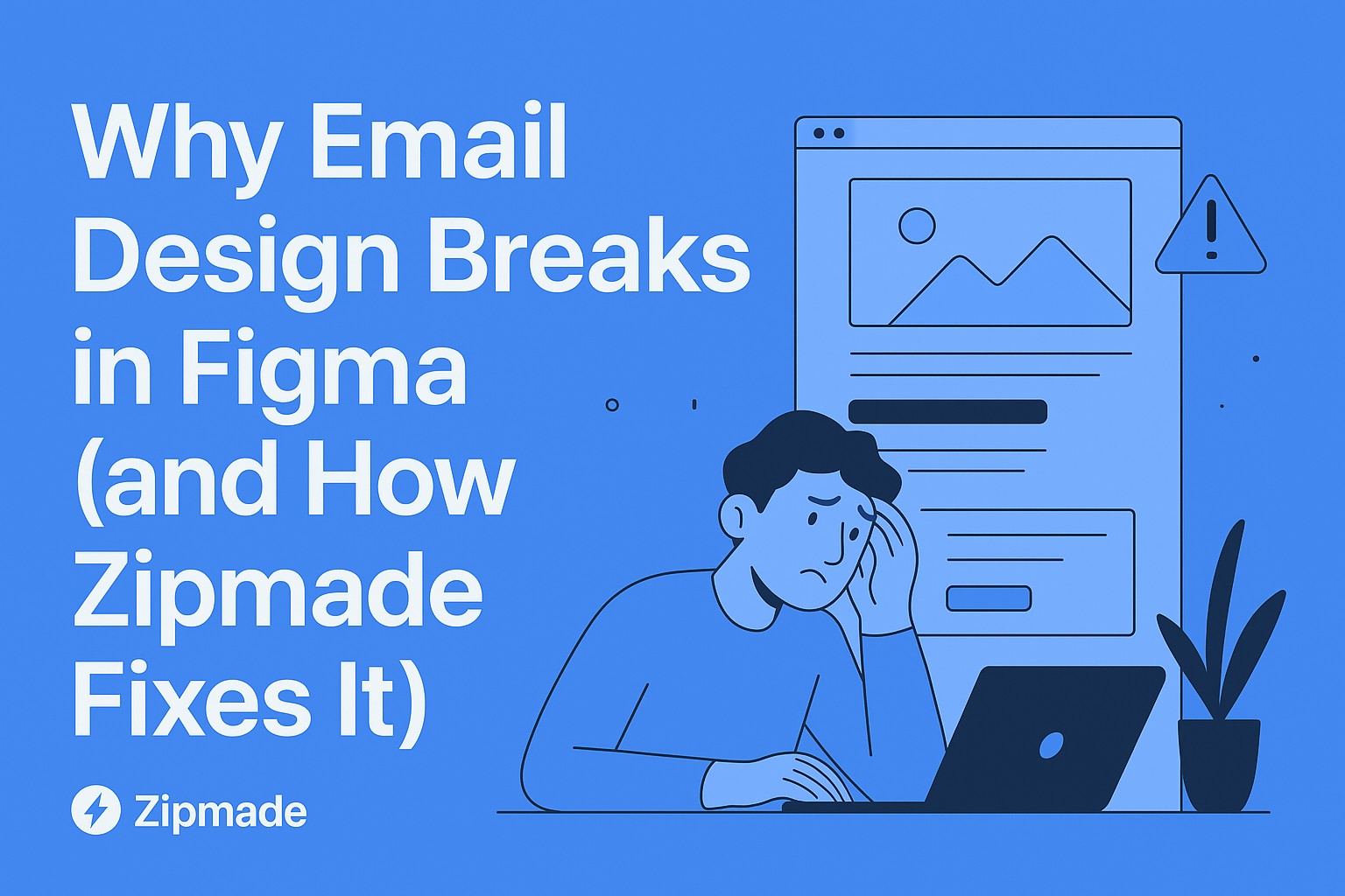
Why Email Design Breaks (and How Zipmade Helps You Fix It)
You’ve spent hours perfecting an email design in Figma. The typography is sharp, the layout flows beautifully, and every pixel feels like a masterpiece. Then you send a test email… and your heart sinks. Text overlaps images. Buttons disappear. Your perfectly orchestrated design is now chaos.
Sound familiar? You’re not alone.
On Reddit’s r/emailmarketing, one frustrated marketer shared how their beautifully designed campaign “looked like Picasso made it” once it landed in Outlook. Another designer confessed that a client’s “perfect” design broke in Gmail because a button coded beautifully in Figma simply vanished. These stories are common — and painful.
But here’s the good news: with the right strategies (and the right team), your designs can look as good in inboxes as they do in Figma. At Zipmade, we’ve helped e-commerce brands, retail companies, and event organizers build bulletproof email campaigns that survive every inbox filter.
Let’s break down how.
1. Start with the Magic Number: 600 Pixels
Most email clients don’t care how fancy your Figma layout looks. They care about constraints. Designing emails at 600–640 pixels wide ensures they display consistently across platforms without forcing horizontal scrolling.
👉 A Redditor once shared how their “stunning 900px-wide design” was chopped in half on mobile. The comments were brutal but true: email clients aren’t websites. Keep it tight.
At Zipmade, we design for these constraints upfront, ensuring your campaign looks good whether it’s opened on a phone in the subway or on an ancient Outlook desktop.
2. Think LEGO, Not Jigsaw: Build Reusable Components
Instead of reinventing layouts for every campaign, build modular pieces you can reuse like LEGO blocks:
Headers: Simple for transactional, bold for promotions
Heroes: Full-width visuals, text overlays, split layouts
Content Blocks: Products, testimonials, events
CTAs: Bulletproof buttons, sized for mobile thumbs
Footers: Legal but clean and on-brand
One Redditor joked, “My devs hate me less since I started using modular templates.” That’s the point — when design and development speak the same visual language, production time shrinks.
At Zipmade, we give clients pre-tested components so every email is faster to build and safer to ship.
3. Typography That Survives the Inbox
Forget exotic fonts — email clients aren’t reliable. Stick to system fonts (Arial, Georgia, Times New Roman) and make them look polished with thoughtful spacing.
Body text: 14–16px minimum for readability
Line height: 1.5–1.6 for flow
Colors: Dark gray (#333333) beats harsh black
A Redditor once shared a screenshot of their gorgeous email where the custom font failed — the fallback was Comic Sans. Yes, Comic Sans. Don’t let that be your campaign.
At Zipmade, we design typography stacks that look professional even when everything “breaks.”
4. Prepare for Dark Mode
Dark mode is here to stay. Many users actually prefer it, and ignoring it is a recipe for disaster. Test your palette in both light and dark.
A story from r/Emaildesign: a user’s Black Friday promo had black text that literally disappeared in Gmail’s dark mode. Thousands of customers saw… nothing.
At Zipmade, we stress-test every design in dark mode to avoid those costly mistakes.
5. Test Like Your Campaign Depends on It (Because It Does)
Email isn’t forgiving. Images might be disabled. Fonts might fail. CSS might be stripped. That’s why testing across devices and clients is non-negotiable.
We check designs at widths like:
320px (small phones)
375px (standard phones)
768px (tablets)
Full desktop
One Redditor put it best: “Designing for email is like sending your art through 20 bad photocopiers and hoping it comes out intact.” At Zipmade, we make sure your “photocopied” version still looks professional.
Why Zipmade Exists
Here’s the truth: most in-house designers don’t have the time or bandwidth to adapt every campaign for the messy world of email clients. That’s where Zipmade comes in.
We act as your catch-all design team, stepping in to:
✅ Optimize your Figma layouts for real inbox performance
✅ Build reusable email components that save time
✅ Stress-test your designs against dark mode, broken fonts, and weird email clients
✅ Deliver on-time, so you can focus on marketing instead of fixing broken emails
Reddit is full of cautionary tales about campaigns going sideways because design didn’t account for technical quirks. With Zipmade, you don’t have to learn those lessons the hard way.
The Bottom Line
Email design is its own beast — one that plays by rules decades behind the web. But when you design with constraints in mind (and have a team like Zipmade backing you up), your campaigns become reliable, scalable, and beautiful in every inbox.
👉 Whether you’re an e-commerce brand launching new products, a retailer promoting seasonal sales, or an event organizer driving registrations — Zipmade ensures your email designs don’t just survive the inbox… they thrive in it.
✨ Ready to stop fighting your inbox and start winning with your emails?
Let Zipmade be your Graphics Design Team-as-a-Service.